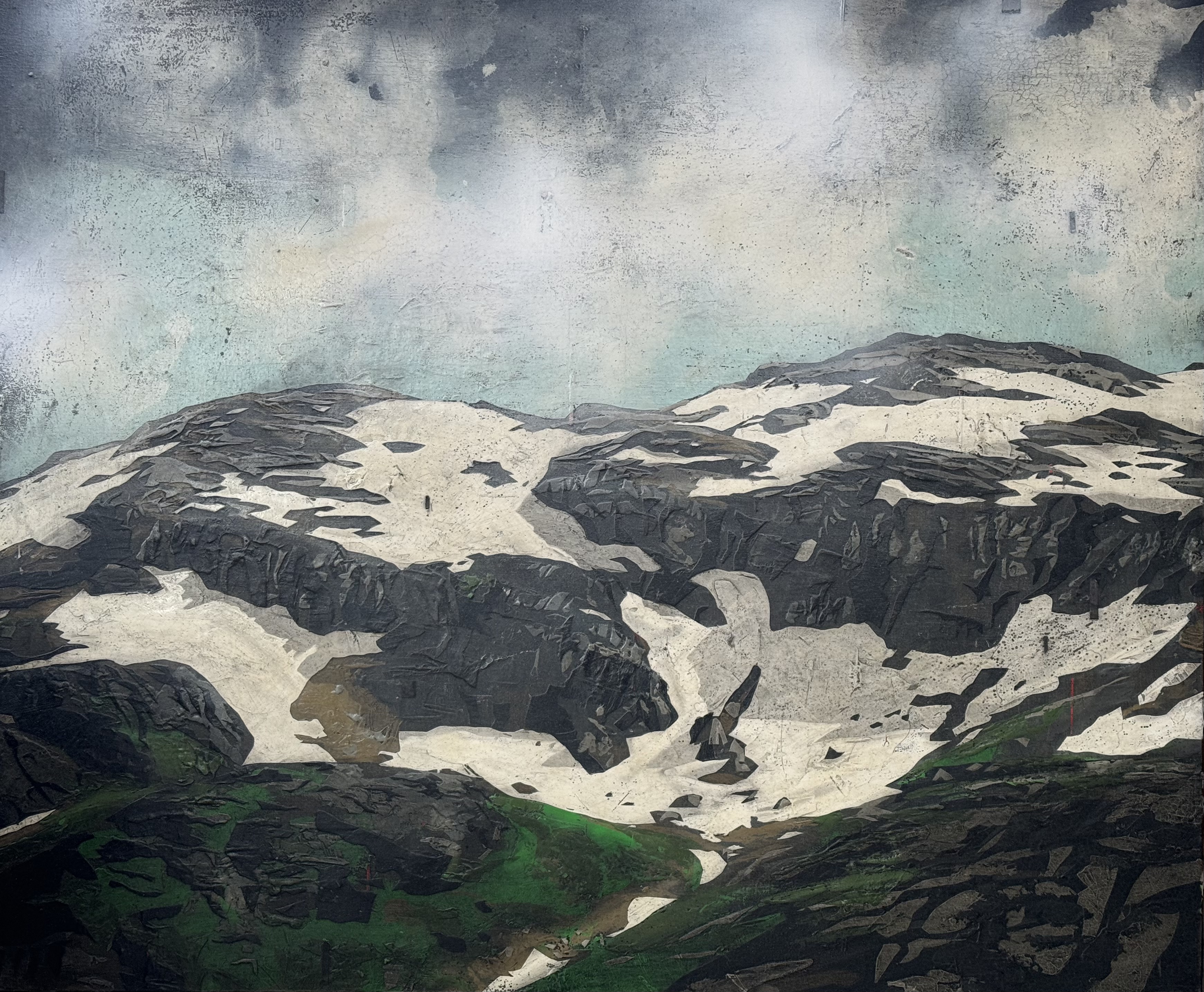
Just a quick post to show four new works that will be presented to an art consultant company working on a cruise ship commission. I was asked to produce two pieces in 100 x 120 cm, and I decided to make a lot of four for my client to choose between. The remaining paintings will probably be on display at Galleri Hantho from 2. november.
I selected a rather diverse pallet for these, as to provide a broad spectrum for the clients consideration.
Have a look …
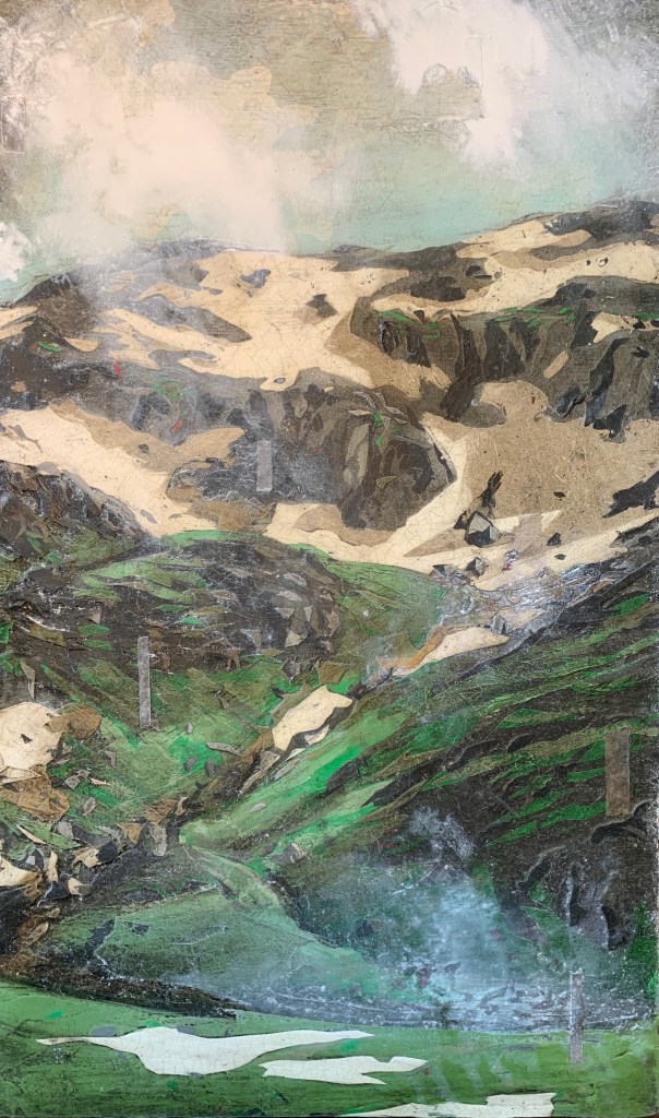
“Fra Kvamsstølen” Acrylic and oil on canvas. 100 x 120 cm.
“Bjergane” Acrylic and oil on canvas 100 x 120 cm.
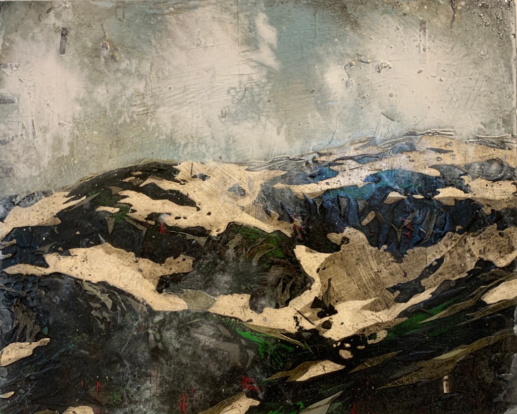
“Verjesteinnuten” Acrylic on canvas. 100 x 120 cm.
I always make an effort to supply my galleries with new works. At times with a busy schedule and many commissions, it’s still important to throw in a few extra pieces that will be worked on alongside the works that are pre-ordered. These two very different paintings have been worked on side by side over the last months. The smallest being a commission for a customer, and the other one will probably end up being selected by one of my gallerists for display in their gallery.
80×120 cm. Acrylic and oil on canvas.
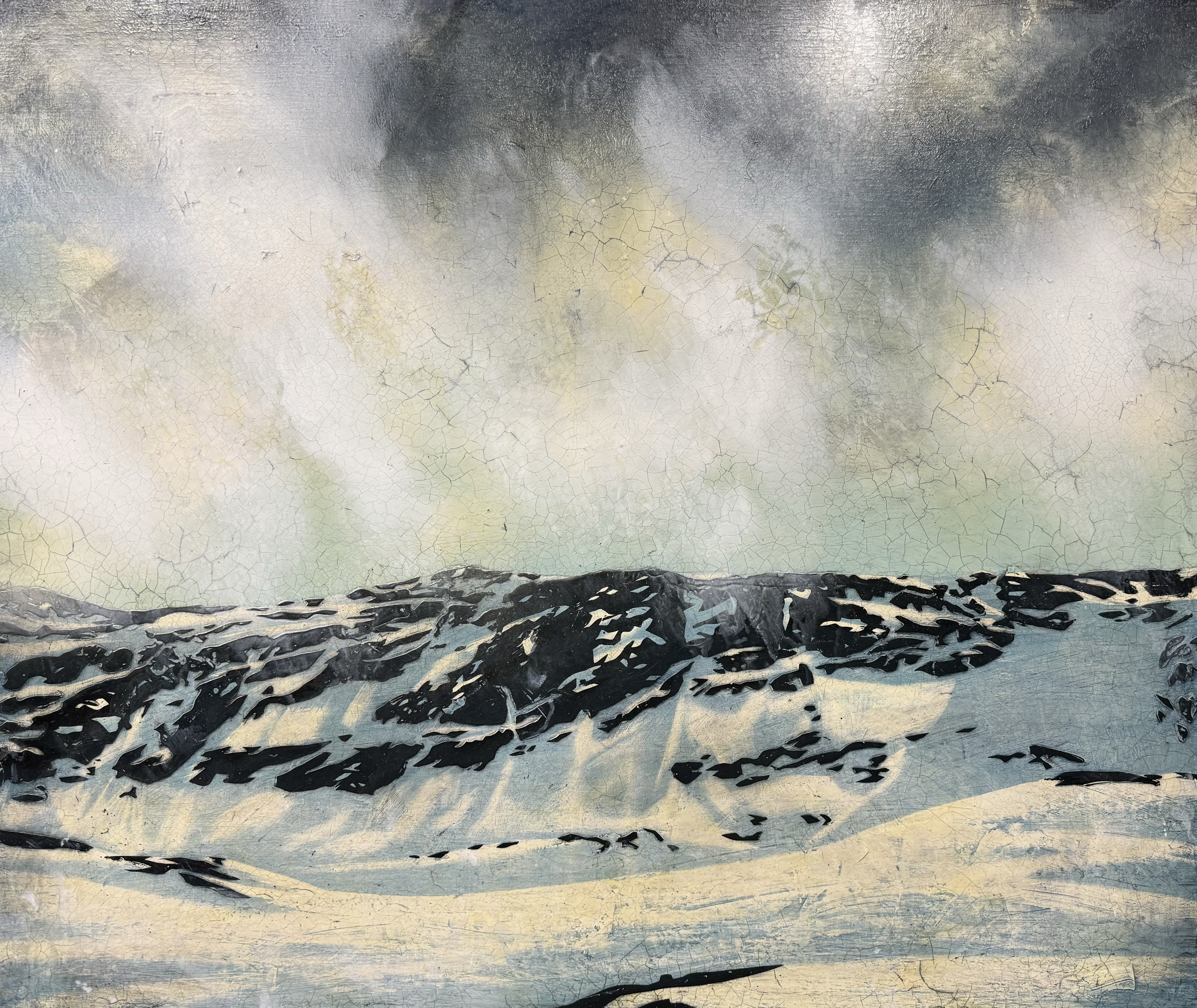
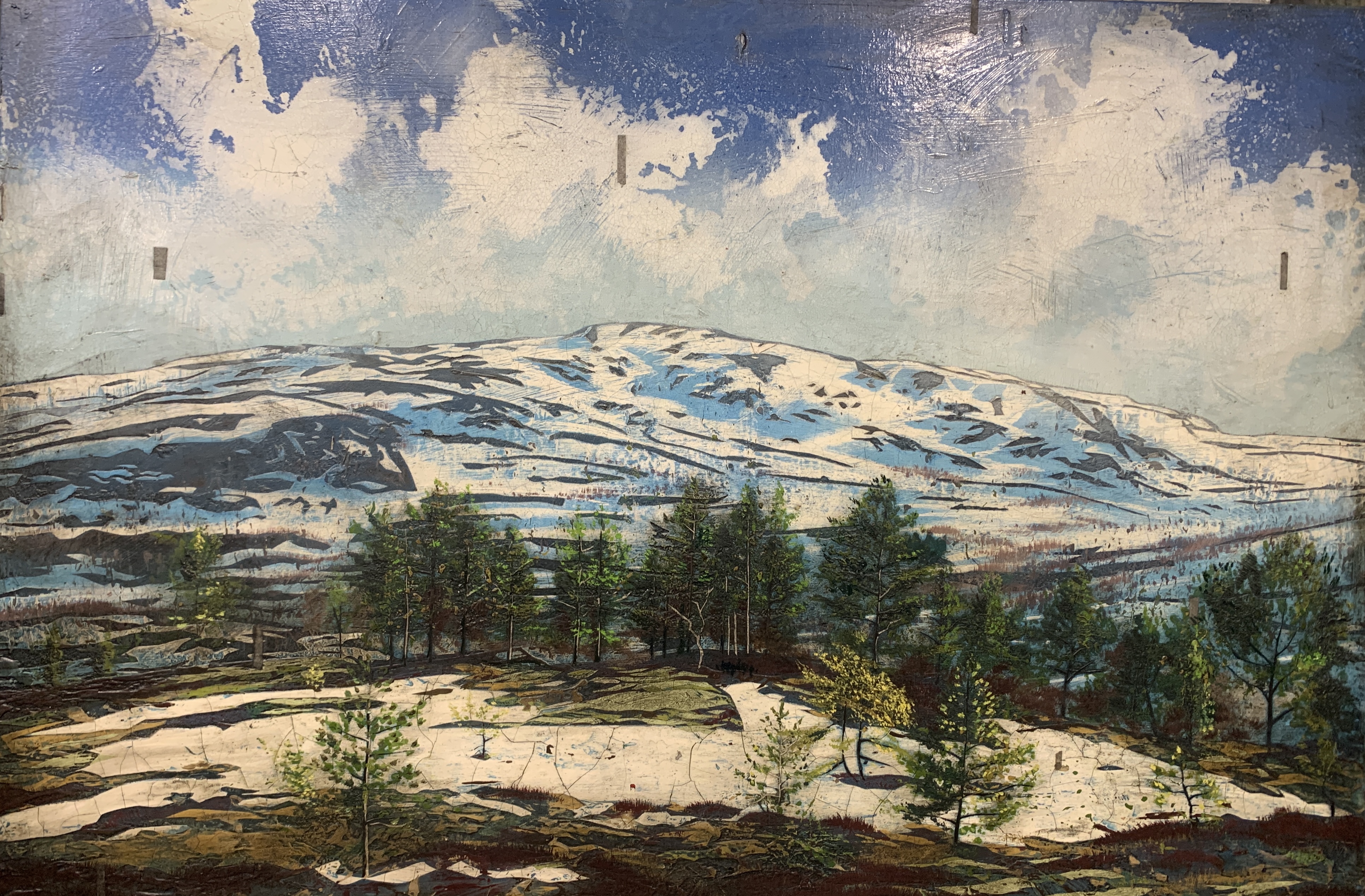
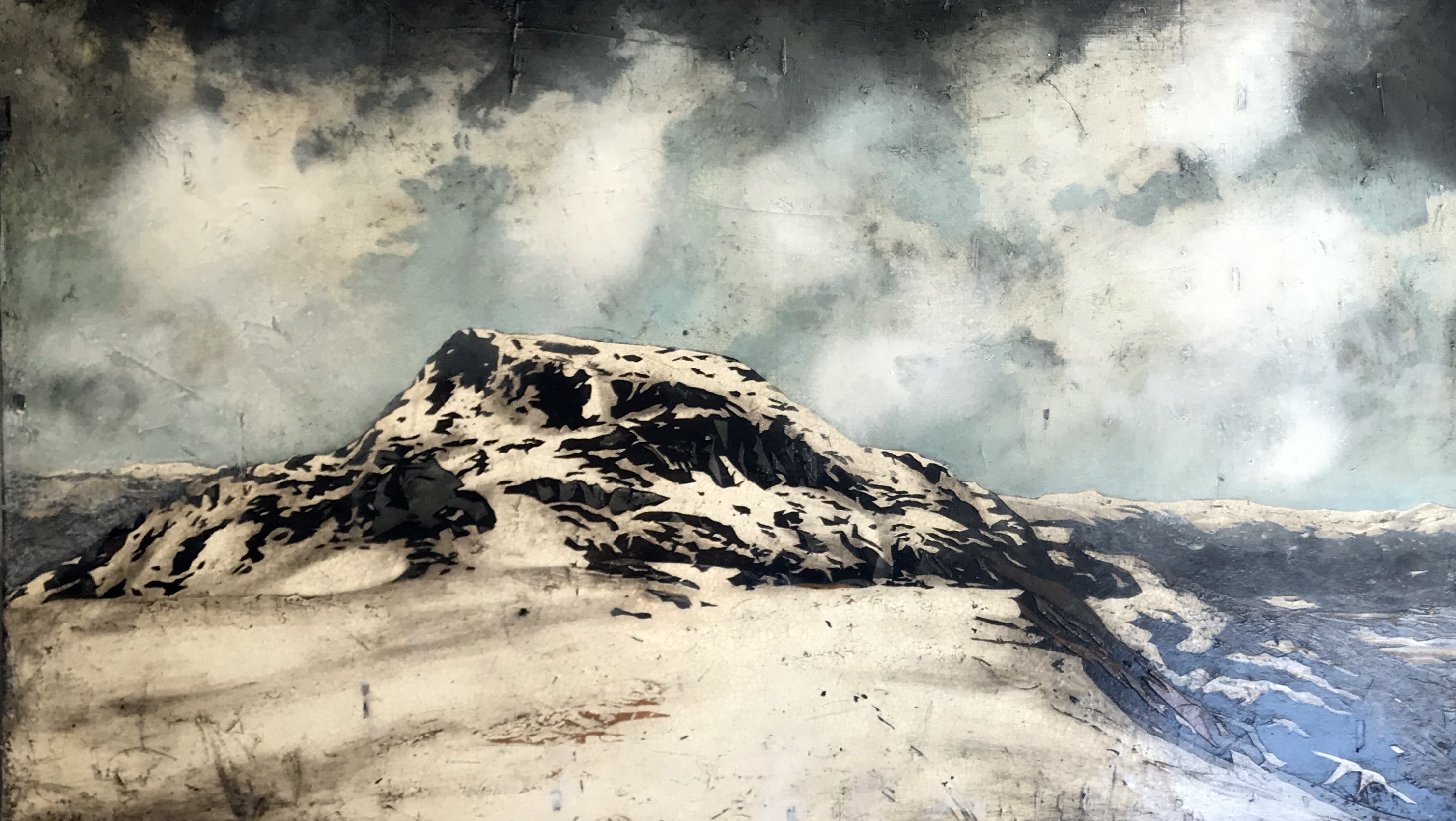
This piece was commissioned by a professional photographer, whom as expected provided the image. I had to take on those midrange trees. I have always found trees to be a challenging task to portray.
I selected this image from a series of pictures provided by the photographer. The reason I went with this one, was the repeating shapes appearing in the foreground, midrange and background. Those are: The patch of snow, the tree line, and the main part of the mountaintop. I would also say that the clouds provide a fourth element of repetition. So it’s a bit like 1, 2, 3 and 4. This rhythm had a special appeal to me.
100×135 cm. Acrylic and oil on canvas.
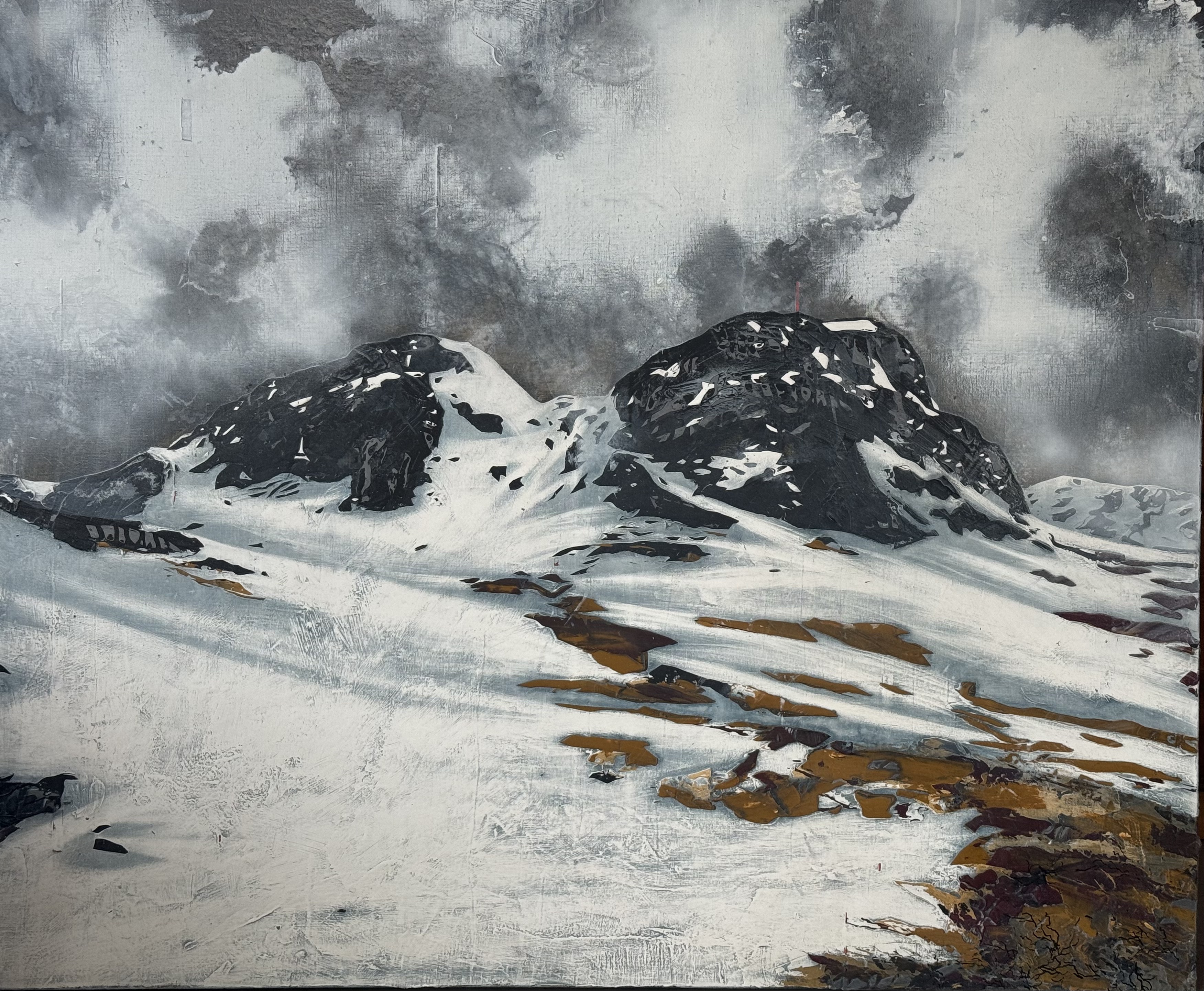
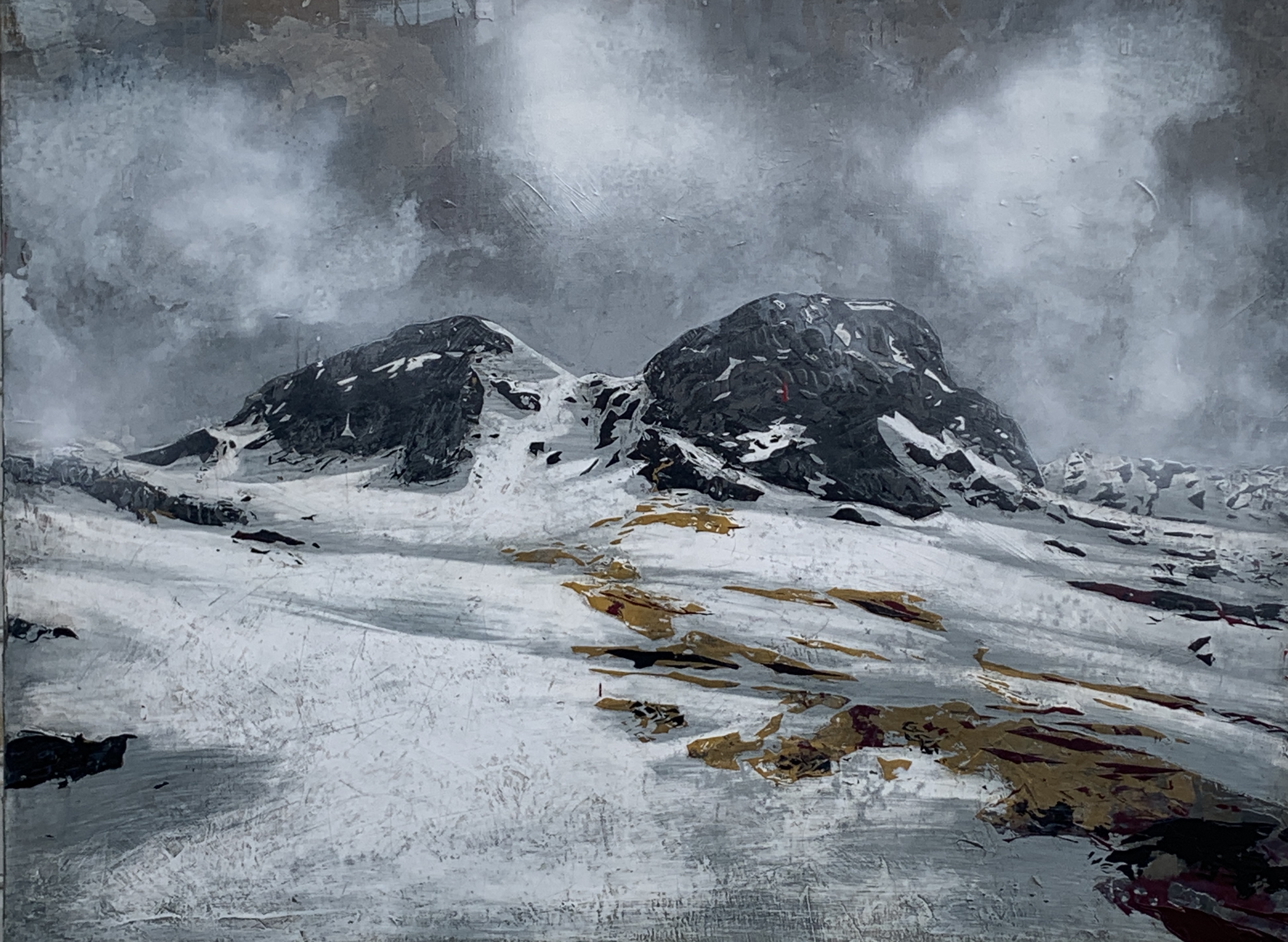
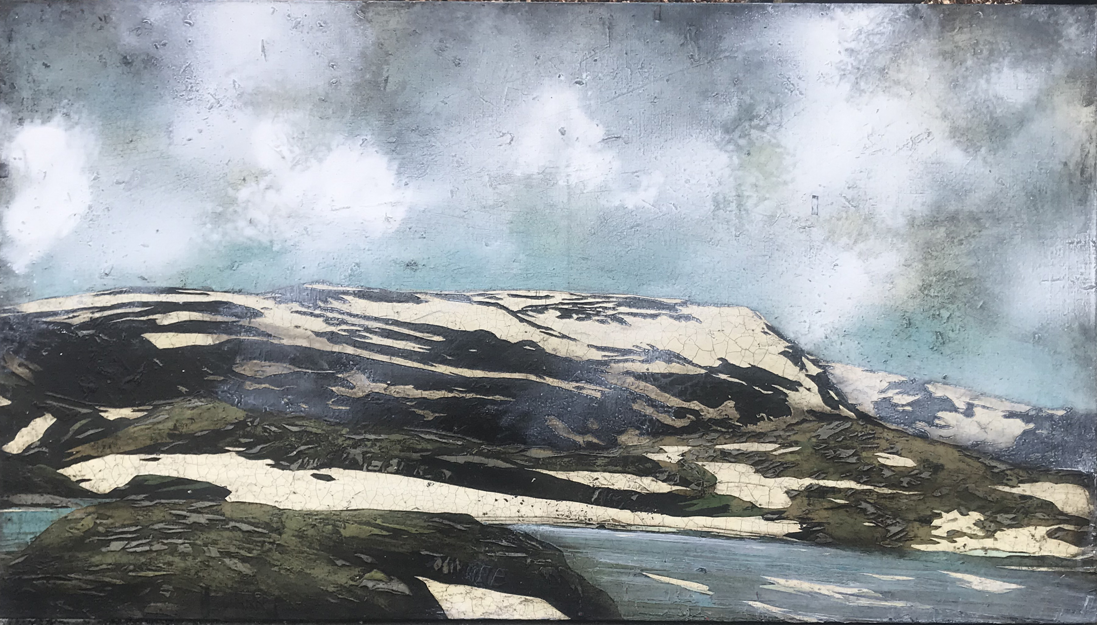
I have actually done this motif before a few times, the first piece being a private commission. This time, I chose to tune down the colour range and give it a gritty grey appearance. Hey, they can’t all have blue skies. For those of us with the privilege of having access to such wonderfull outdoor hikes, we all know many days will be overcast and grey. It’s still a sublime experience.
Snow has been the most central feature of my works in the series of landscapes. It’s been a hallmark in which my followers has been able to recognise my works for over a decade. I felt it was time to challenge this modus and try something different. It proved to be a much more complex and difficult task than expected.
The patches of snow usually simplifies and draws up the landscape, creating a wonderful dynamic. The lack thereof forced me to get stuck into a lot of tiny details. It’s hard to simplify without creating a mess. I have observed this problem in numerous landscape paintings by other artists, and can only imagine the struggle they have gone trough. Yet, when you finally get there, the result can be very rewarding. There is no quick way to do this. You have to take one feature at the time and slowly build up the layers.
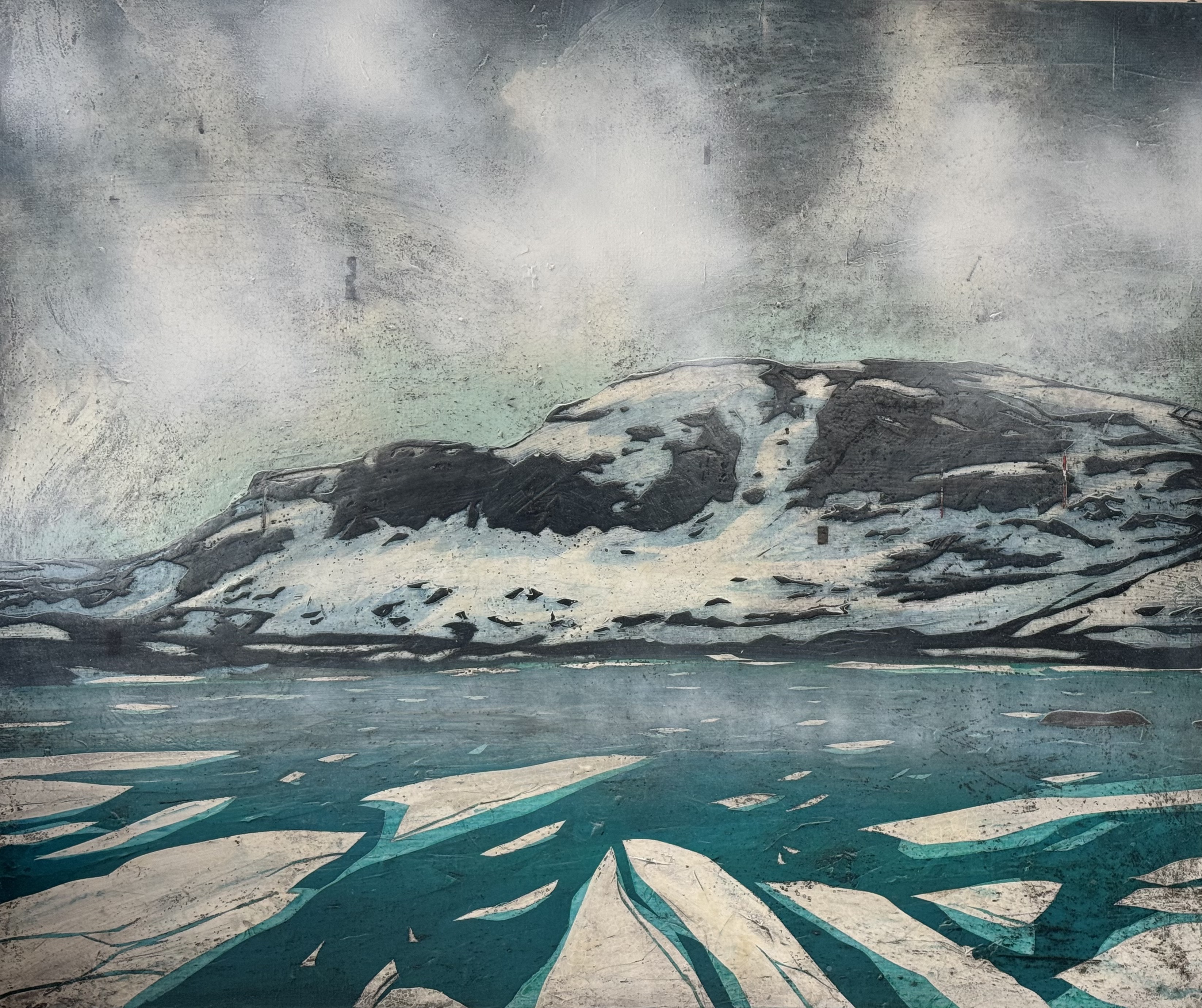
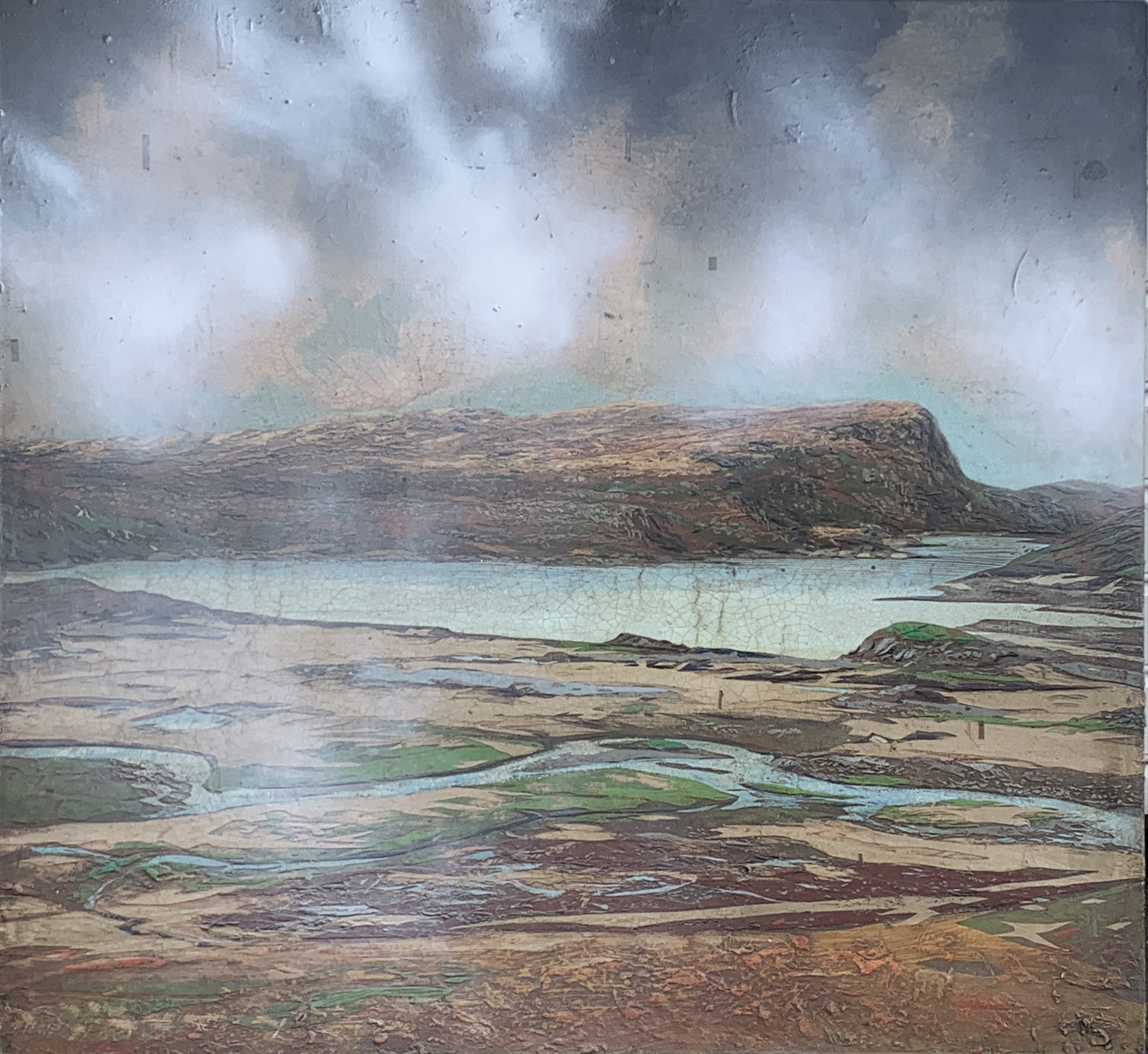
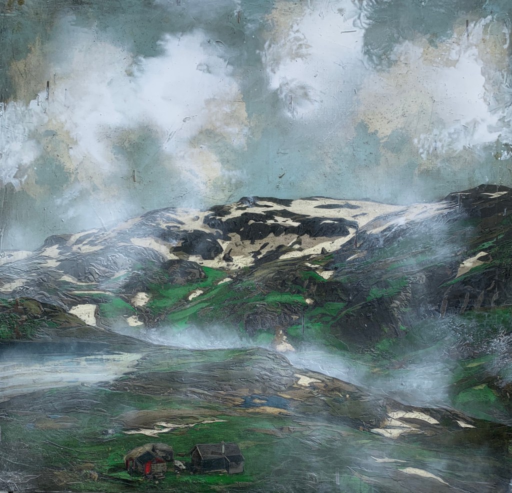
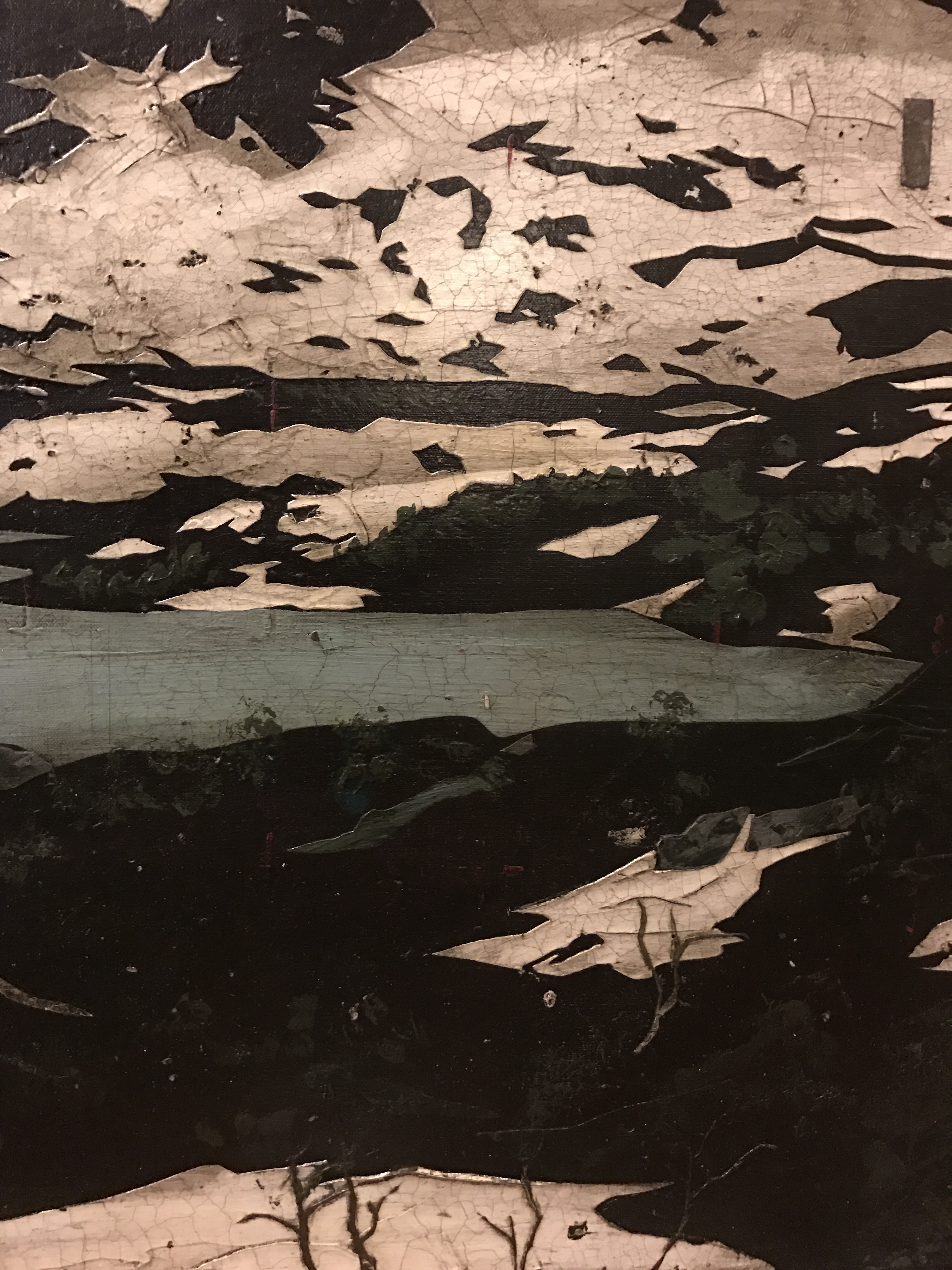
The lake in this painting is the reservoir of the biggest hydro power plant in Etne, and a dam was built in the first half of the 20th century. They also drilled a passage, allowing them to taketh level down 11 meters. The dam also gained 11 meters, giving this reservoir a total range of 22 meters. At low level, the landscape turns in to a moon like environment, exposing the lakebed and all its minerals. It sure can be exiting to explore, but the visual impact is brutal. The maximum water level can be seen in the small green patch on top of the hill in the mid ground. This rock (or hill) turns into an island when the water level is high. It rarely is, and this is how we usually experience it.
“Løkjelsvatnet”. 120 x 135 cm. Acrylic and oil on canvas.
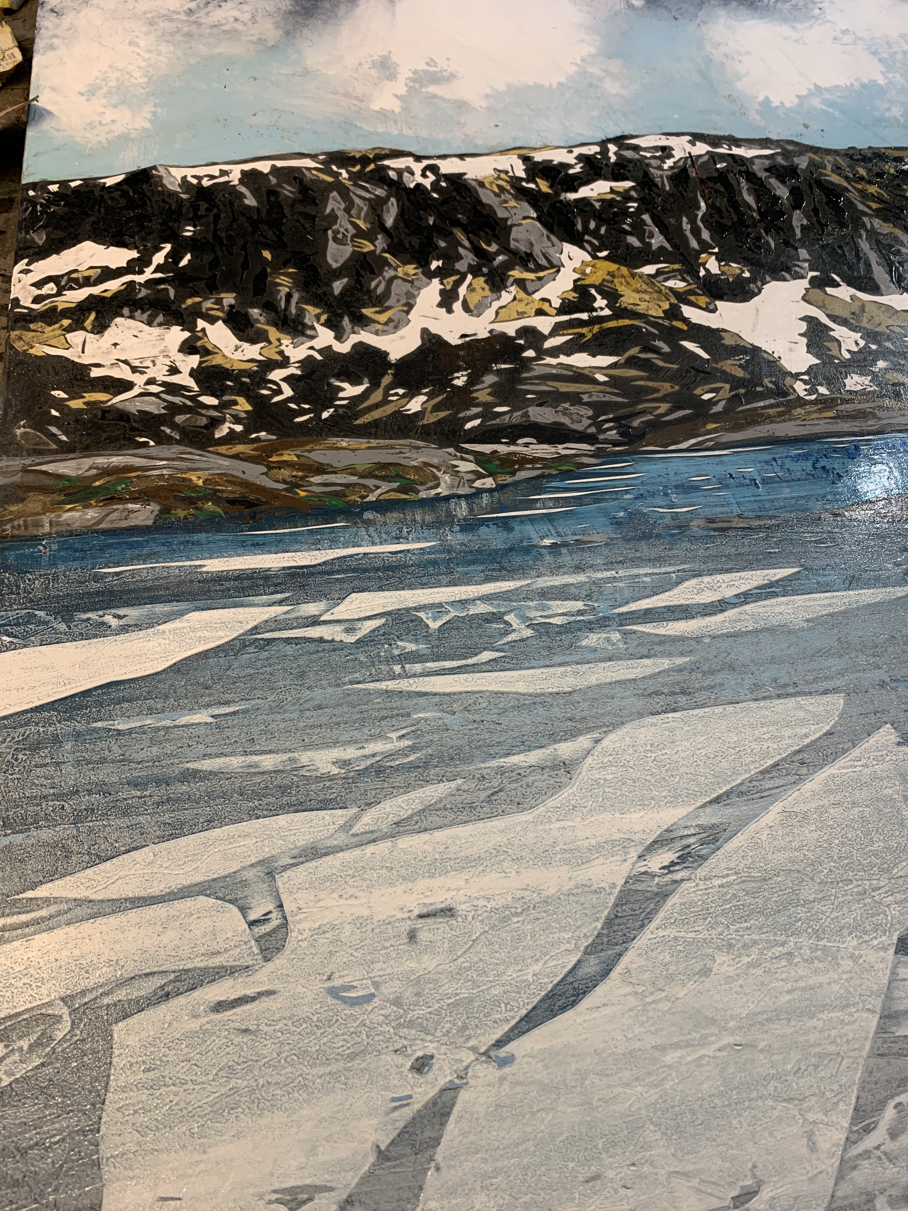
Sometimes I get into situations when a certain area seems impossible to resolve, even after several attempts. This problem might derive from a too limited scope of input. A restricted set of solutions are reserved for each individual type of area. Some very few examples being the sky and clouds, the bare fields of dry beige gras, the rocky patches, snow patches, and as in this instance: Ice drifting on water. For each type, there seem to be a protocol. A go to solution. Sometimes that falls short.
It works 95% of the time, so why not here? Is there another magic tool in toolbox?
Help might come from rather unexpected sources.
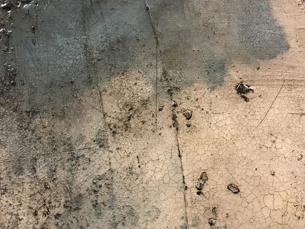
The granular surface was created by the instance of rain and the material sanded of the surface just prior.
I’m currently making a 130 x180 cm piece for a client. Now, the photo was taken by the commissioner himself, and it seemed a great starting point, however I did not take into consideration the vast area of water in the foreground. This turned out to be my achilleas this time. I planned to construct a pattern of ice to replace the non-event of the dark water of the original picture.
I applied a series of layers, and this usually does the job. After a few rounds, I was at an impasse. I was surely going in circles. One layer after the other. More structures and even more icebergs on top. Too much space and no real dynamic.
As a last resort, I took the painting outside and gave it a heavy rub with sandpaper. This sort of «restart» sometimes gives me a better chance at starting fresh. The sanding created a lot of white and blue grains in the water, a somewhat milky touch. It was starting to look a bit more interesting, but “no sigar”.
Then I heard a faint thunder, shifting winds and at last heavy rains followed suit. In a split second I stopped myself from rescuing the painting into the studio. I simply let the rain hammer the surface for a short moment. Shortly, an amazing structure appeared in the milky white and blue. It was like I was saying: «Well, nature, I can’t resolve this, now you have a go». The randomness of nature can be great if harnessed and captured.
No, this is not a blog about me getting into environmentally friendly materials. It’s literally about colour.
I have always had a bit of a struggle working with green, so I knew from the start this was going to be challenge.
The summer of 2015 was indeed rather unusual. The hard winter left a substantial amount of snow extending the “motif hunting season” into the summer. Another curious aspect of this, was the the exchanging of the browns and beiges into different shades of green, some rather intense.
Whenever the snow pulls back exposing the soil to the sun, the ground thaws and the gras will eventually come back. Normally the process takes a few weeks and this occurs in a mixture of earthy colour up against the white snow. For 2015, the patches of snow lasted much longer and the ground was exposed to a much higher temperature. This speeding up gave us white and green! This series of paintings are all from the same location using the exact same image.
There is a lot going on, I admit. I spent months adding details that had to be covered up in the end. It just got too busy.
So, maybe not to everyone’s liking, here are some “Very late in the season-Rafdals”.
“Kvamsstølen 2015” Acrylic and oil on board.“Kvamsstølen 2015” Acrylic and oil on board.“Kvamsstølen 2015” Acrylic and oil on canvas. 145×140 cm.
Occasionally customers approach me with the desire to have a piece made from a location of their own choice. How can I make this work for both my client and myself? What if, at the end of the line, the client decides the artwork isn’t quite like he/she imagined it? And how about taking on something that doesn’t quite go along with my style and preferences?
I have made this easy for both parts by making some rather simple requirements:
You may bring your own photo reference for the piece. However, I’m inclined to reject any image that doesn’t meet the standard for my production. The image doesn’t have to possess the atmospheric details my paintings and drawings entail. I quite often start with a rather plain image. Some level of sunlight might add some interest, as it sure gives the landscape more depth and “volume” through the casting shadows. The number one reason for rejecting an image is the amount and distribution of snow. No a dark mountain with a few reclining patches of snow at the top, please.
“Into the Silence” From seljestad. This is the first version of four paintings in various formats. The couple commissioning this piece has now mounted the painting in their mountain cabin, and it looks great.
My most recent commission for a private client. This impressive scenery is taken from Lysenuten between Sandeid and Vikedal. 140×80 cm. Acrylic on canvas.
You are merely given the option to be the first to consider the piece. I will make it according to my preferences, and you will take it or leave it as is. Sorry, I will not add your sisters dog in the foreground or give the skies a little purple tint to go along your recently purchased wall paper. It is what it is …
On the other hand, you are not obliged to take the piece. I will hopefully find another client for it. No hard feelings.
I will reserve the rights to make further version from the same motif.
A painting might offer a completely different experience depending on the distance from the actual surface. A constant challenge for me has been to make my works interesting to explore for those who dare to take a few steps closer. I work with a number of techniques in order to get structure and the desired cracked varnish, reminiscent of old masters work. To be honest, I treat my works in a very rough manner throughout the process. The are constantly subject to distressing, catching, sanding and general damage sustained from being tossed around the studio.
I even put some bits of tape (although the acid free type) in between the last couple of layers. I often get questions about this, and will not offer any deep intellectual answer; it just looks correct to me.
However, the most frequent question I get is of a more technical kind and concerns the craquelure. How do I do this? Well, there are probably many ways to achieve this certain effect. I use a special two step varnish by LeFranc & Bourgeois. In fact, I constantly drain my supplier i Oslo of the entire stock. It takes a bit of training to get around it, as it has kind of a life of it’s own, but even when things go terribly wrong, there might be som great effects worth keeping. Although the painting itself is made in acrylic, the last touch of white clouds and mist is obtained by applying diluted white oil color (mixed with terps and a generous helping of liquin, a special drying medium) adding this on top of the cracking varnish.
Most details are cut in masking tape and applied in a thick layer of acrylic.
Impossible to control, yet very attractive when everything goes as planned.
“Frå Haukeli”Acryllic and oil on canvas 170×125 cm.