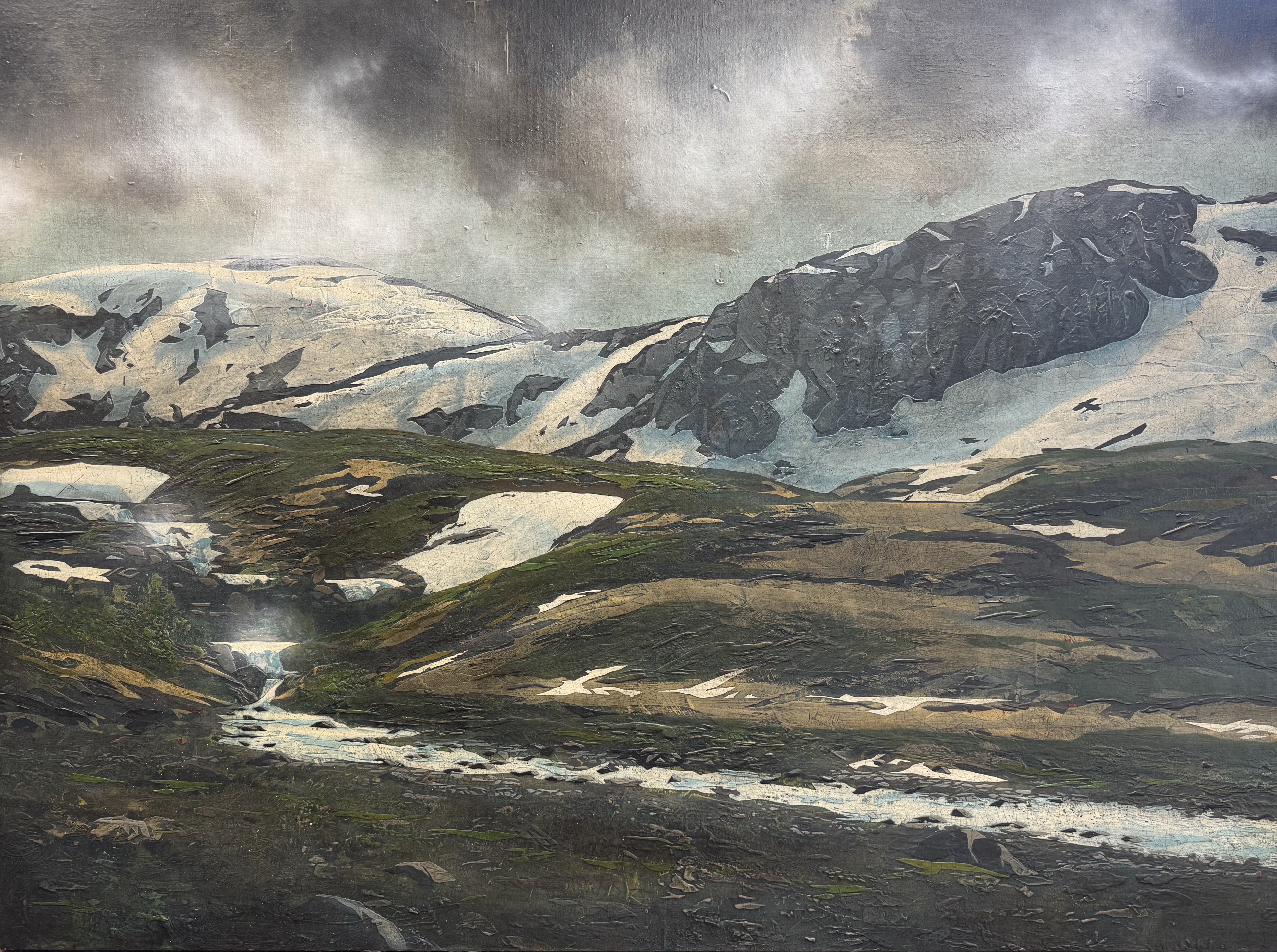
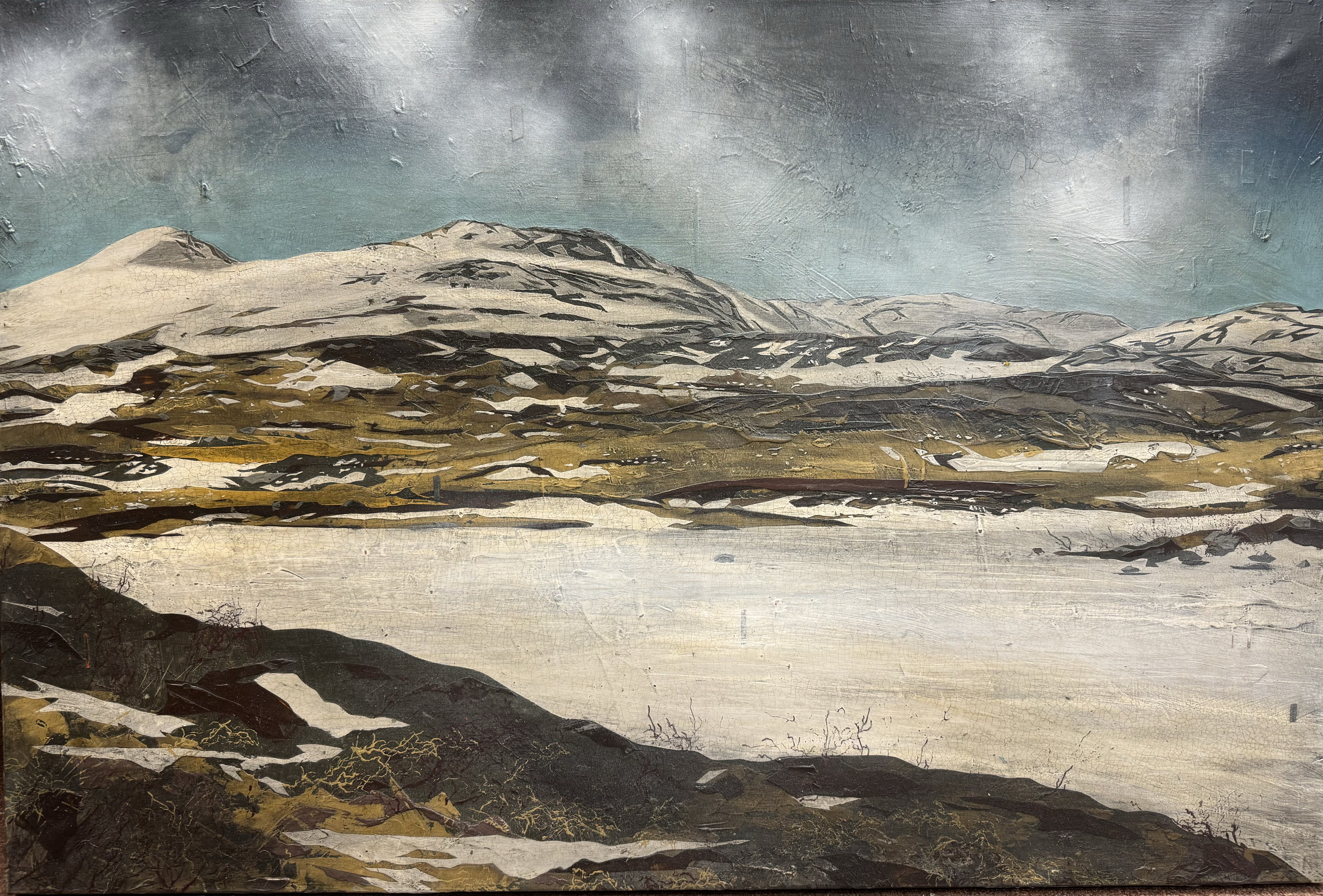
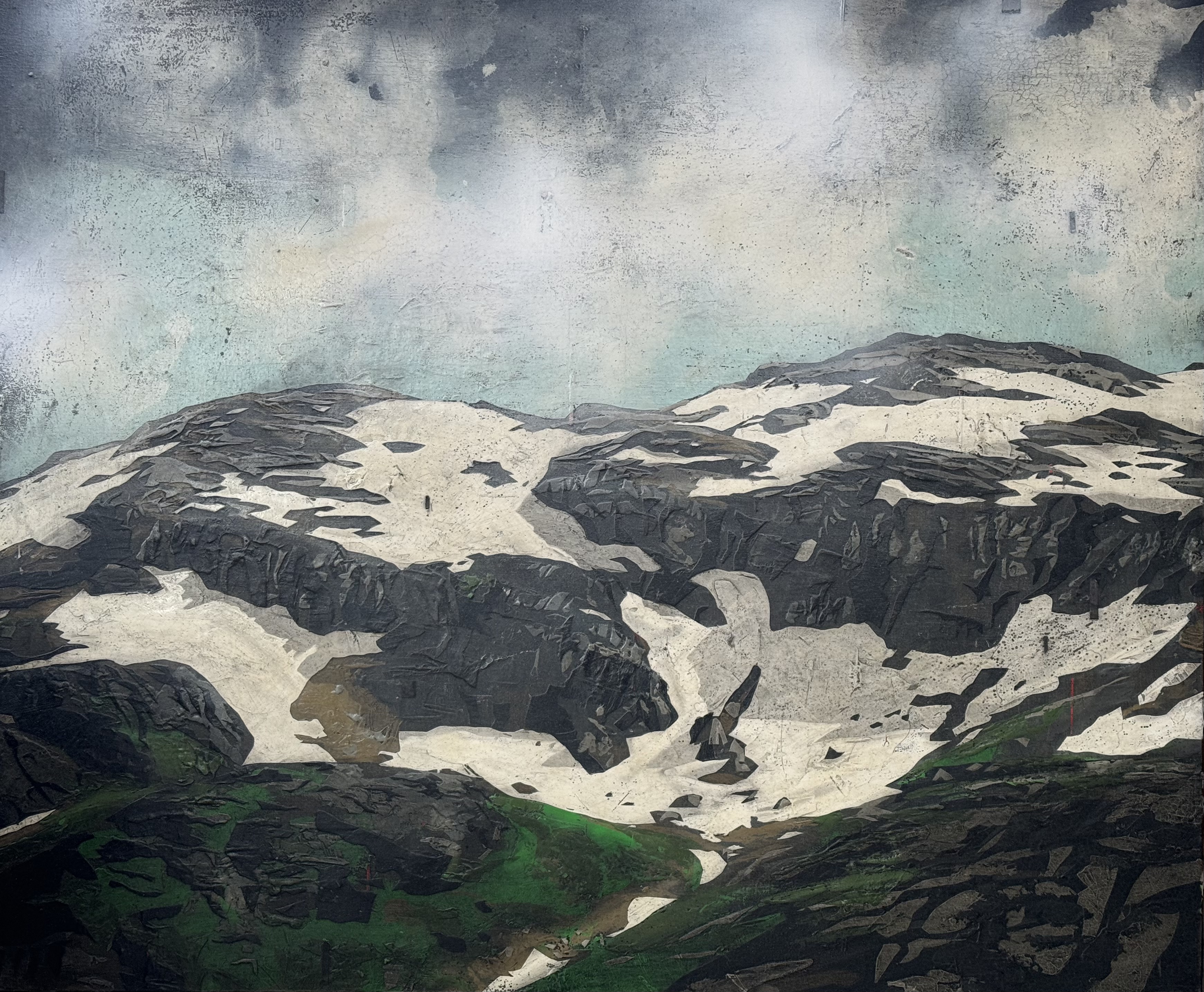
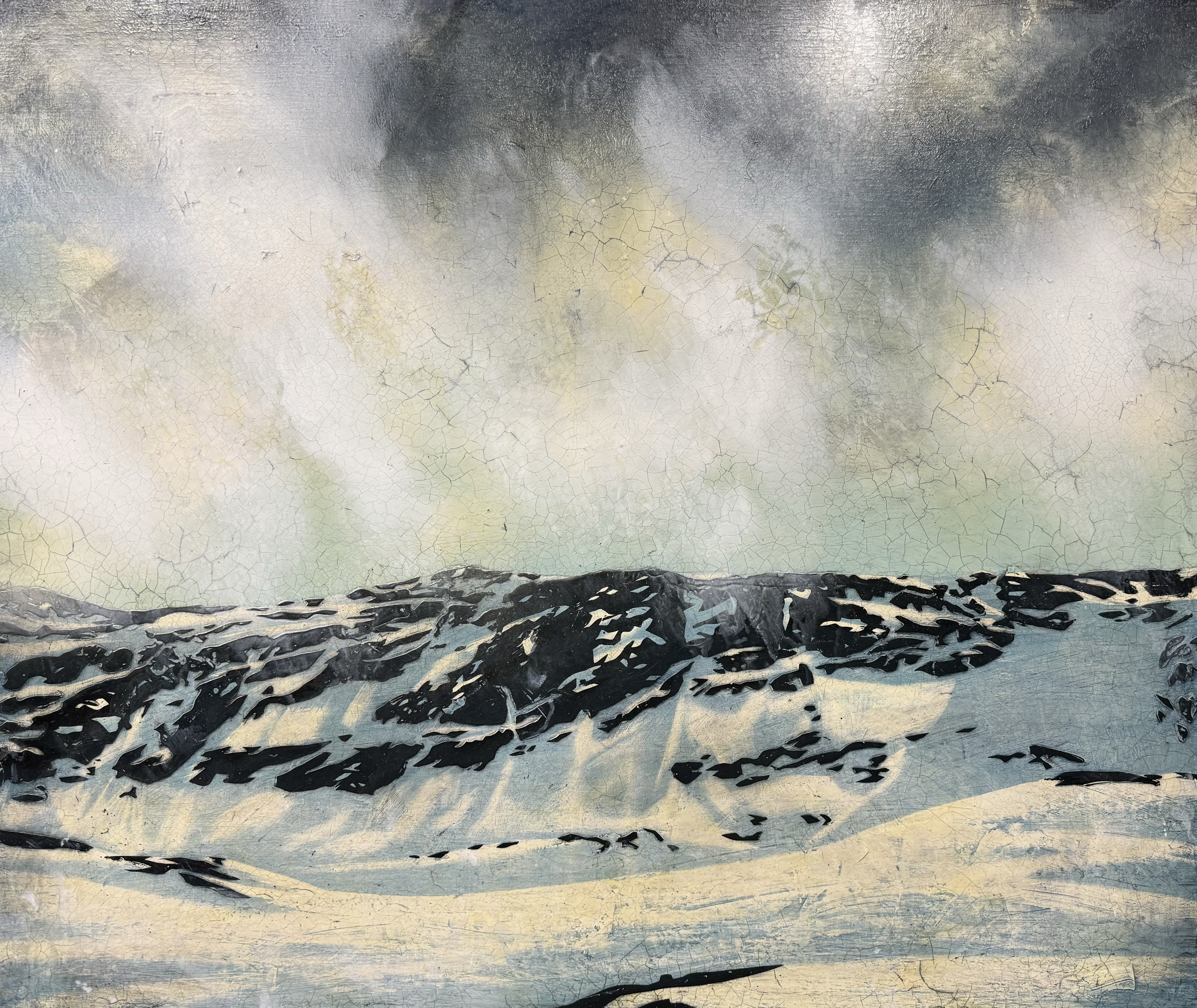
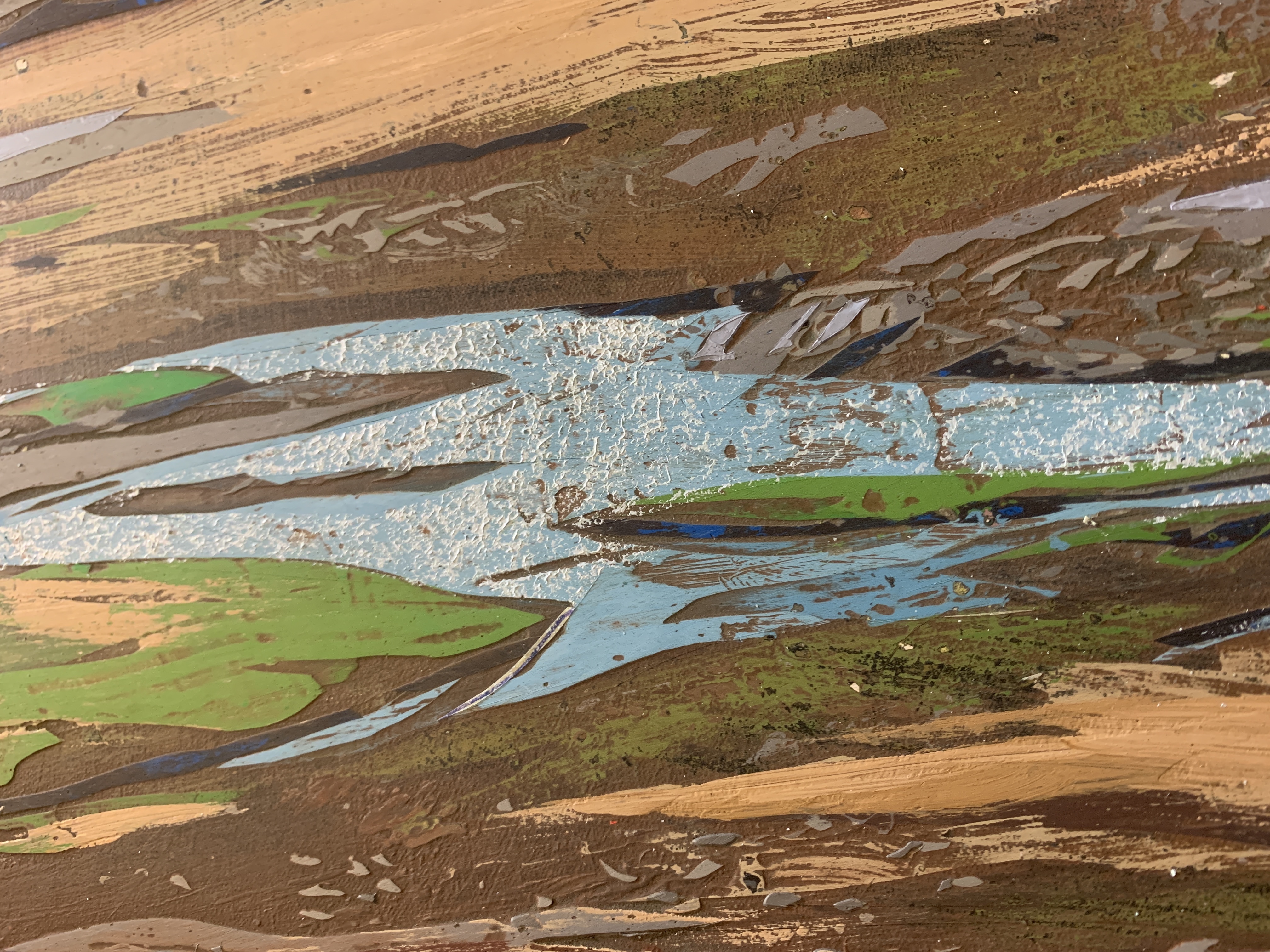
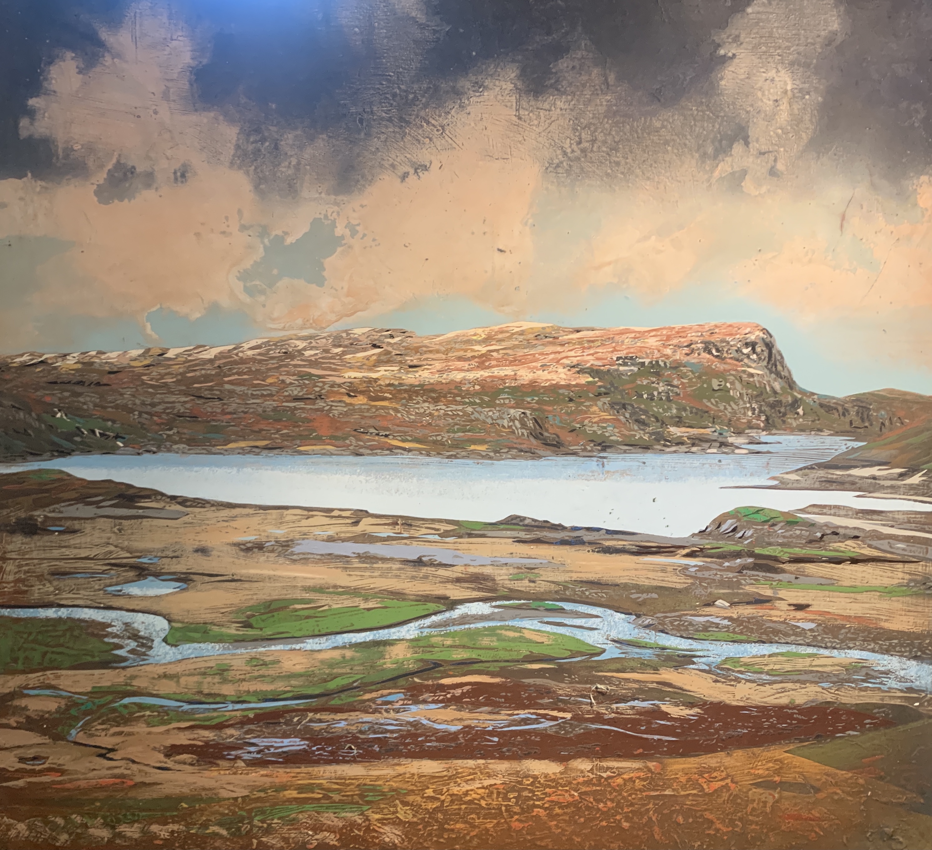
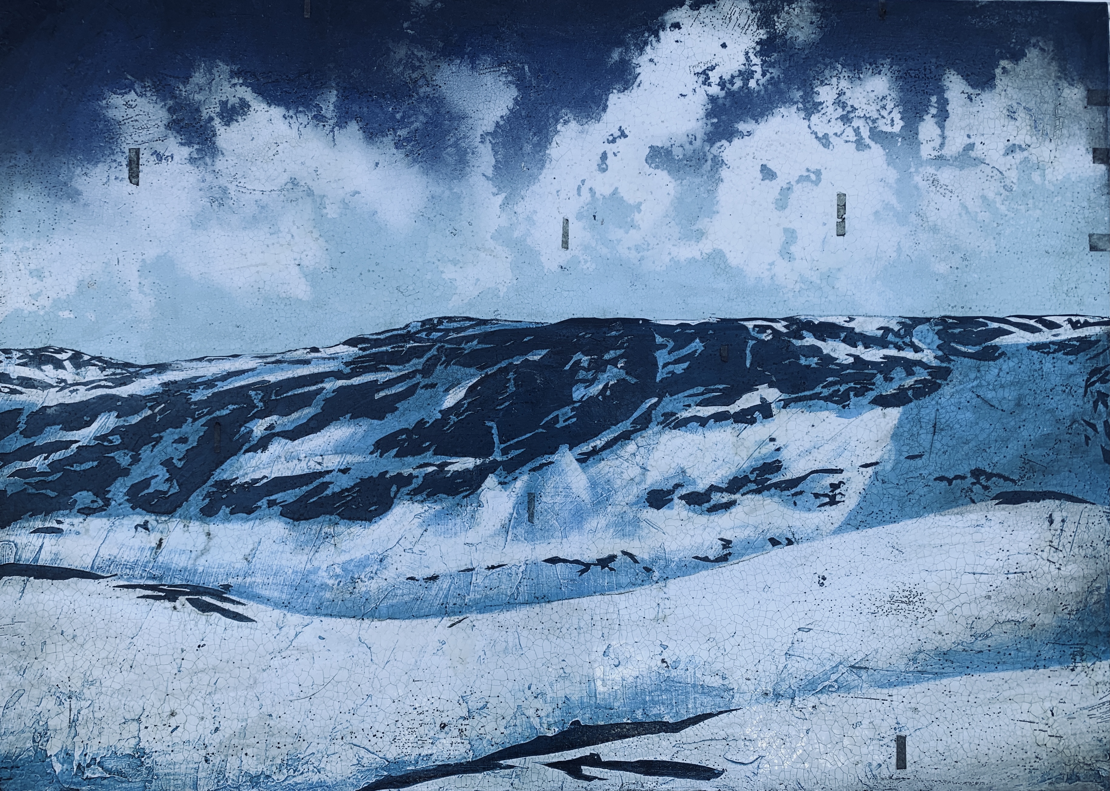
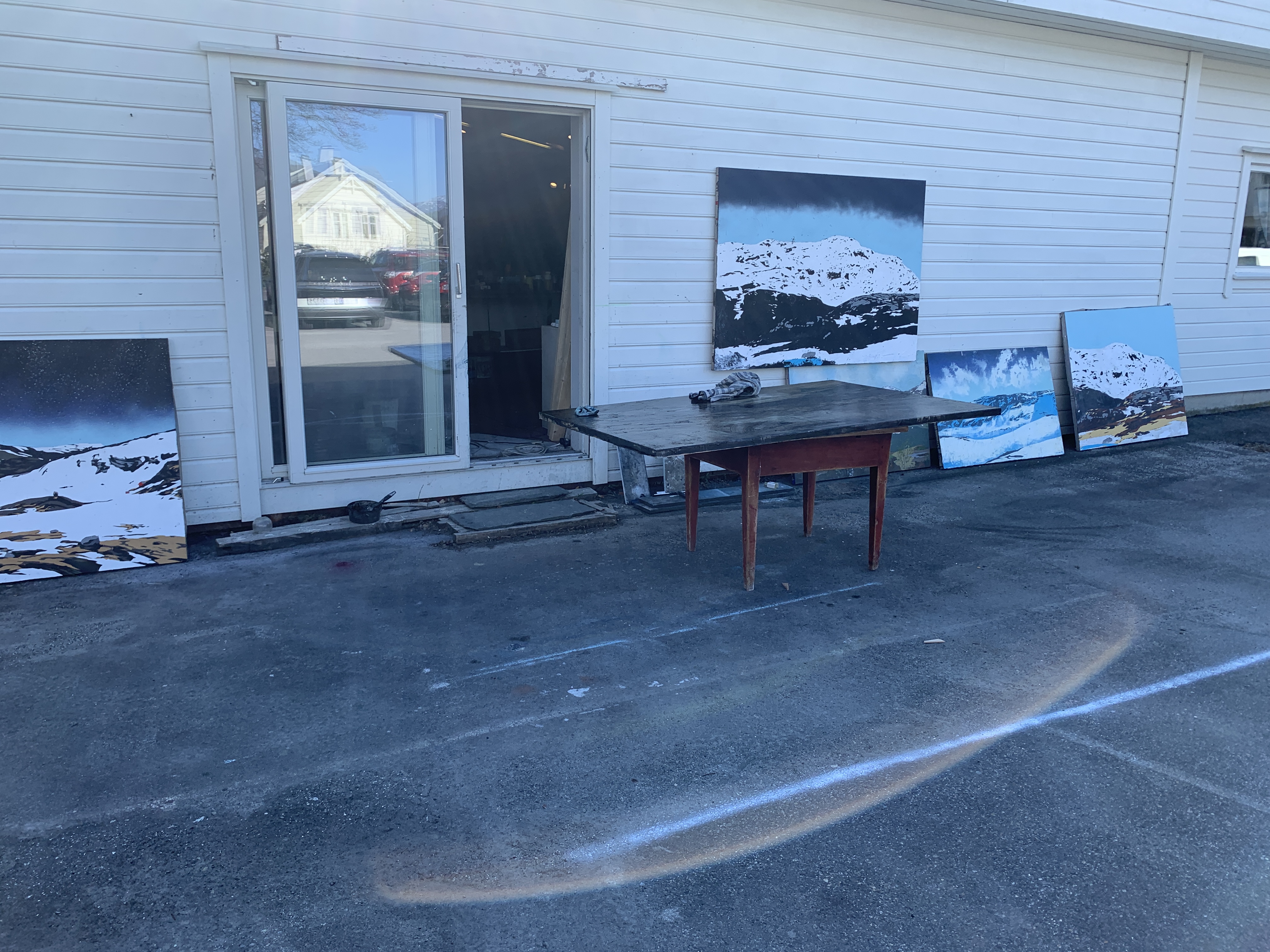
Water in motion

Tags

To capture the movment of water is a very demanding task for any artist. In order to grasp this subject, it’s useful to take a look at some of the great masters of this subject. Amongst the many talented painters we find Fritz Thaulow. His ability to represent the tones, shapes and movement in water is paramount in the field.

“Åborenuten” 125×170 cm. Acrylic on canvas 2025.

As for me, I would have to approach this using references directly from the image and then build up layers of shapes that could create motion. I’m always using a photo as reference. However, for moving features like a spring or river, it’s hard to capture the energy without having a clear memory of the actual site.

This challenge proved to be very interesting and will probably be revisited in future projects.

About the Artist

Tags

, , , ,

Artist Bio:

Jan Terje Rafdal B. 1974 Education
1996-99: Ba (Hons) Bath Spa University College. UK 1994-96: Visual Communication. Vk 1 & 2 Garnes Vgs. Norway 1993: Foundation Course. Drawing. Garnes Vgs. Norway

Selected Solo exhibitions:
2024: Galleri Hantho, Haugesund.
2024: Retroperspektiv utstilling. Dahl Rammeservice, Haugesund.
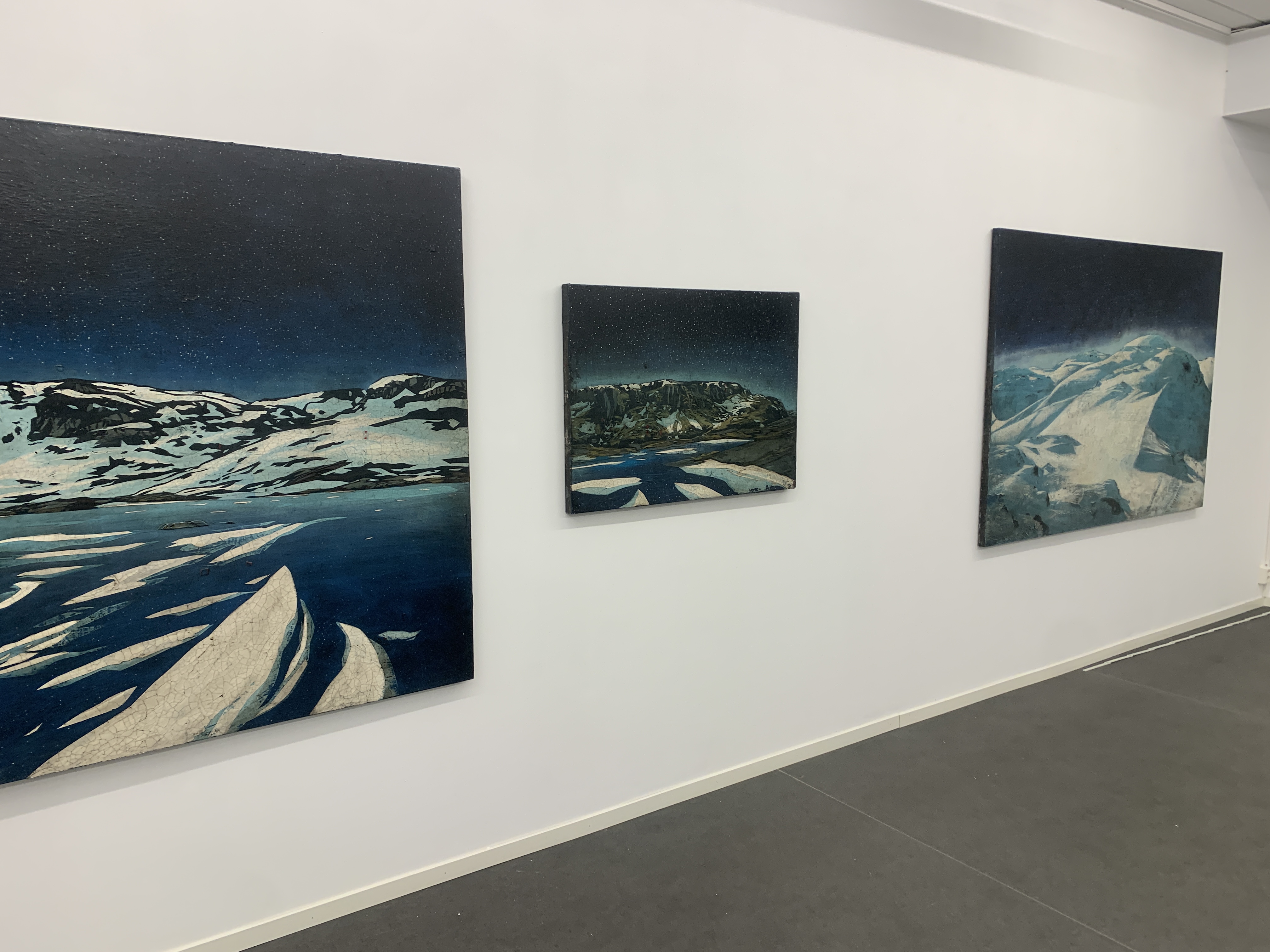
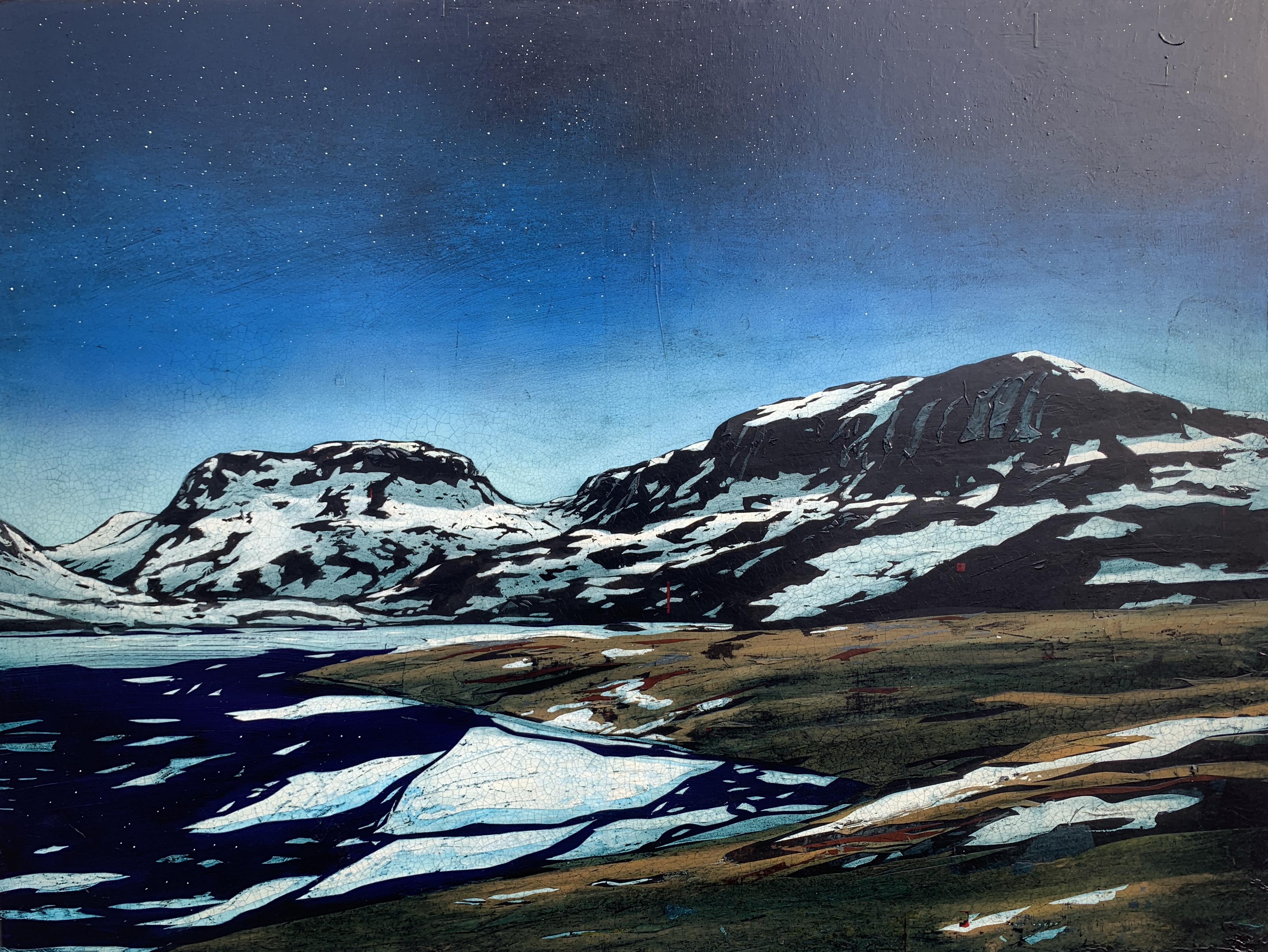
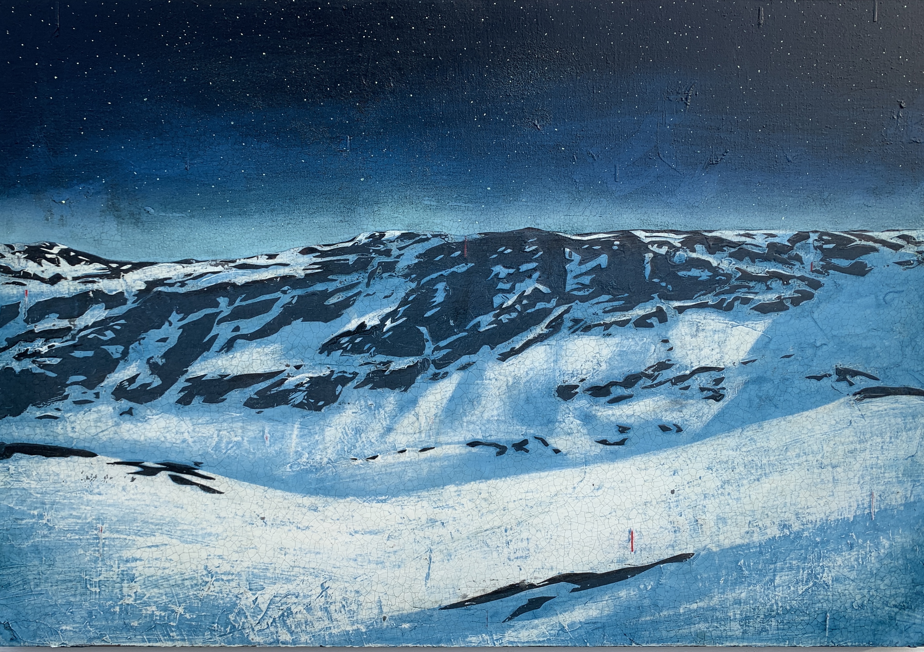
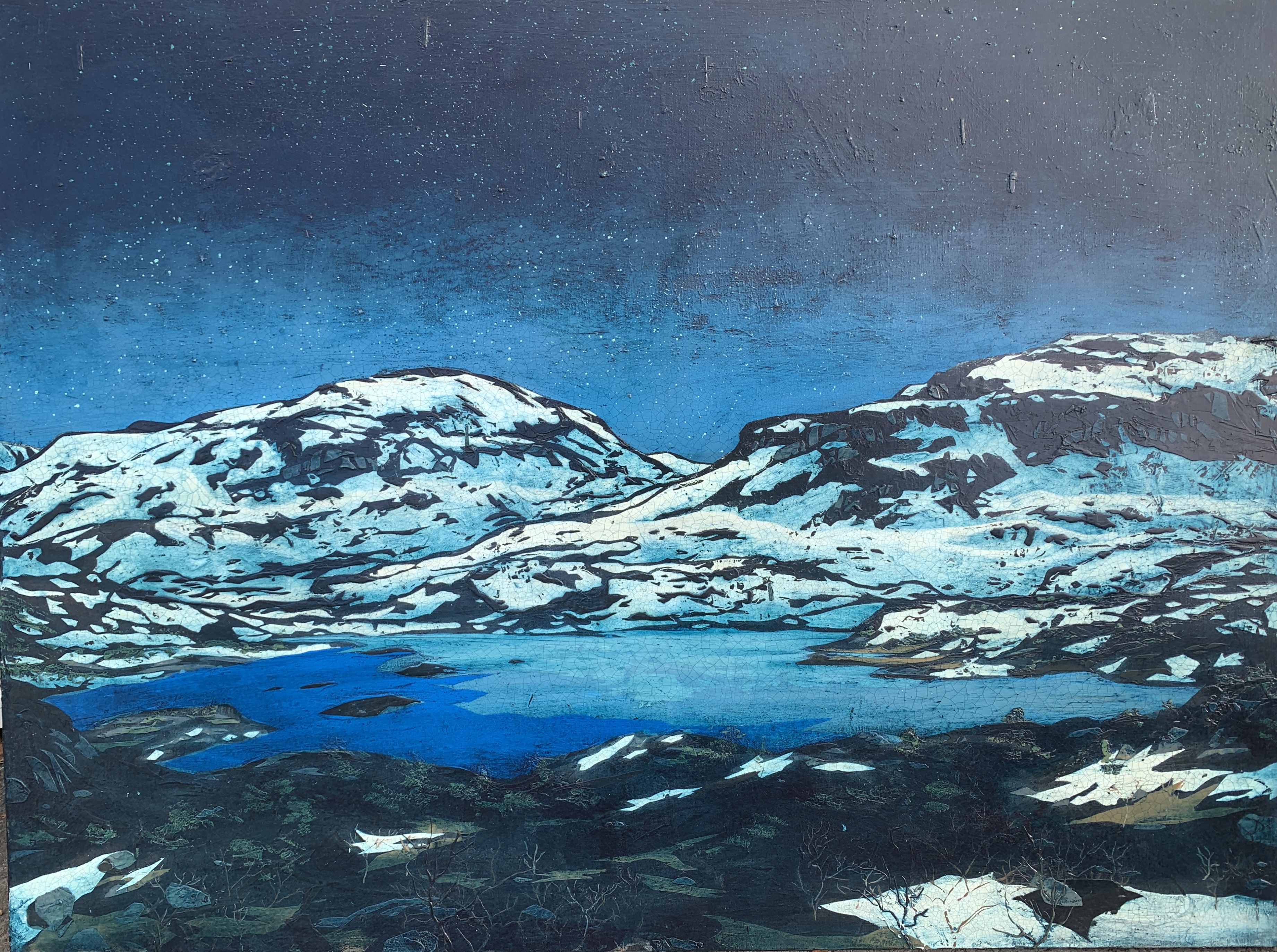
2023: “Inn i den Stille Natt” Galleri Giga, Leirvik.
2023: “Felix Fiigenschou X” Karmøy Kunstforening. Kopervik.
2023: “Felix Fiigenschou IX” Sunnfjord Kunstlag. Førde.
2021: “Felix Fiigenschou VIII”. Galleri EKG. Hamar.
2020: “Den Store Stillheten” Haugesund Kunstforening/Hauges. Billedgalleri.
2019: Galleri Giga, Stord.
2019: Galleri G, Sandnes.
2018: Galleri Hagalid, Ryfylke
2017: Galleri G, Sandnes.
2017: Røldalsterrassen, Røldal.
2017: Bryne Kunstforening.
2016: Galleri Allmenningen.
2016: Galleri Art Veritas, Gothenburg.
2016: Galleri Giga, Stord.
2015: Samuelt Tveit-stiftelsen. Tinghaug. Sauda. 2014: Galleri Allmenningen, Bergen. 2014: Tysværtunet.
2013: Klepp Kunstforening. 2012: In Transit, Galleri Giga Stord. 2012: Felix Fiigenschou V, Halsnøy Kloster. 2011: “Felix Fiigenschou IV”. Galleri BI-Z, Kristiansand
2008: “Jurassic Coast”. Bryne Kunstforening. Bryne. 2008: “Felix Fiigenschou III”. Cooperhuset, Balestrand.
2007: “Felix Fiigenschou II”. Galleri Sult, Stavanger 2007. “Ancient Landscapes”. O! Space. Manhattan, NY 2006: “Botanika”. Black Swan Art Centre, Sommerset, UK
2006: “Jurassic Coast”. Tysværtunet.
2005: “Felix Fiigenschou I”. Haugesund Museum, Haugesund 2004: Galleri Siverts, Bergen 2003: Galleri Giga, Stord 2003: Galleri Adamstuen, Oslo 2003: Hillestad Galleri, Hillestad 2002: Rostra Gallery, Bath, England
2001: Bømlo Art Society, Mosterhavn
2001: Neo Galleri, Stavanger 2001: Galleri Adamstuen, Oslo 2000: Galleri Siverts, Bergen 1999. Galleri Hillestad, Aust Agder 1997: “Søm du vil”. Haugesund 1996: Onarheim Gård, Husnes 1995: Fjordform, Åpnings utstilling Etne 1992: Sæbøtunet, Etne 1989: Galleri Casiopeia, Ølen

Selected Group Exhibitions:
2024: Oud, Haugesund
2024: Karmøyutstillinga.
2024: Haugesund Kunstforening sin Høstsalong.
2023: “Felix Fiigenschou X” Karmøy Kunstforening. Kopervik.
2023: “Felix Fiigenschou IX” Sunnfjord Kunstlag. Førde.
2022: Karmsundutstilinga. Haugesund.
2022: Haugesund Junstforening sin Høstsalong.
2021: Haugesund Junstforening sin Høstsalong.
2020: Karmsundutstilinga. Haugesund.
2019: “Axiom Mnemosyne” Galleri EKG, Hamar.
2018: De Wijde Stilte; Drie Bijzondere Collecties in Beeld II.
Marie Tak Van Portvliet Musem Domburg. Netherlands.
2017: Haugesund Kunstforening.
2016: Haugesund Kunstforening.
2016: Hovudustillar Karmsundutstillinga, Haugesund.
2016: Sommerutstilling Lavetthuset Hovedøya, Oslo.
2015: Galleri Art Verita, Gothenburg.
2015: Tour des Fjord. Galleri Giga, Stord.
2013: “2113” Haugesund Kunstforening. (Haugesund Art Museum).
2012: Karmsundutstillinga.
2011: Skårutstillinga.
2010: Galleri Voss.
2009: “Imaginalis”. Chelsea Art Museum. Manhattan, NY 2008: Affordable Art Fair, Bristol. 2008: “Me” Haugesund Museum. 2007: Christmas exhibition, Haugesund Kunstforening. 2006: New Year exhibition, Malby Contemporary Art, Winchester 2005: Christmas exhibition, Haugesund Kunstforening. 2003: Christmas exhibition, Haugesund Kunstforening. 2001 “Skulptur 2001” Internasjonal Sculpture Symposium. Os 2001: Christmas exhibition, Haugesund Kunstforening. 2001: Christmas exhibition, Malby Contemporary Art, Winchester
2000: Tysværtunet Easter Exhibion 2000 Haugesund Kunstforening.. Christmas exhibition, Haugesund 2000: Karmøy kunstforening, Christmas exhibition, Karmøy 2000: Galleri Ryfylke. Juleutstilling. Sand 1999: Degree show ´99. Bath, England 1999: Peep show. Mall Galleri, England (London) 1999: Søm du vil. Haugesund 1998: Vindafjord kunstlag. Sandeid 1998: Galleri Ryfylke. Sand 1996: Søm du vil. Haugesund
Awards: 2022 Haugesund Sparebank’s Culture Award 2022. 2012: Grafill, Diploma for «Fiigenschous Kodeks» with “Work in Progress”.
2011: Gullsild for project Sildajazz 2011 with Ginungagap Design.


Public and corporate commissions:
2024: Viking Dagur. Two Paintings for Viking River Cruises.
2023: Stiftelsen Metodisthjemmet, Bergen.
2023: Gulating Lagmannsrett. The Courthouse in Bergen.
2022: Viking Neptune. Two paintings for Viking Cruises.
2020: Viking Octantis. Three paintings for the Explorer’s Lounge.
2019: Painting for oil platform Johan Sverdrup. Equinor.
2018: Etne Caresentre. Centre Piece for main reception.
2015: Tysvær Omsorgsenter.
2013: ConocoPhillips, Tannanger. 2013 “Skakke Senter for Skule, Idrett og Kultur”.
2013 “Juanita, Supply vessel – J.J. Uggland Companies/Salt Ship Design A/S.
2011: ConocoPhillips commemorating the event of the Eldfisk project.
2010: Sculpture. Etne Sparebank. 150th anniversary. 2009: Statoil. Hospital module on “Gjøa”. 2008 Barclay’ss Bank, Bournemouth. 2007 BNP Paribas. London branch. 2007 Eni. Forus, Norway 2005 Sculpture installation. “Millennium park of Sandeid city hall” 2005 Statoil, Huldra. Accommodation module. Works in public collections:
2018: Balestrand Kommune. Sogn og Fjordane.
2016: Havforskningsinstituttet. Scientific research ship ”Dr. Fridtjof Nansen”.
2016 “Nasjonalt Klageorgan for Helsetjenester”. Office in Bergen.
2014: The Norwegian prime minister’s office. Oslo.
2009. Hampshire County Council Contemporary Art Collection.
2005. City of Haugesund Museum Art Collection.
Publications:
2005: “Felix Fiigenschou”.
2007: “Felix Fiigenschou II”.
2012: “The Fiigenschou Codex”
2022: “Kattenes Kriminalprotokoll”. Kapabel Forlag.
2025: “Kattenes Kriminalprotokoll II”. Kapabel Forlag.

4 x 100 by 120.

Just a quick post to show four new works that will be presented to an art consultant company working on a cruise ship commission. I was asked to produce two pieces in 100 x 120 cm, and I decided to make a lot of four for my client to choose between. The remaining paintings will probably be on display at Galleri Hantho from 2. november.

I selected a rather diverse pallet for these, as to provide a broad spectrum for the clients consideration.

Have a look …

“Fra Kvamsstølen” Acrylic and oil on canvas. 100 x 120 cm.

“Bjergane” Acrylic and oil on canvas 100 x 120 cm.

“Verjesteinnuten” Acrylic on canvas. 100 x 120 cm.

“Haukeli” Acrylic on canvas. 100 x 120 cm.

Two new paintings

Tags

, ,

I always make an effort to supply my galleries with new works. At times with a busy schedule and many commissions, it’s still important to throw in a few extra pieces that will be worked on alongside the works that are pre-ordered. These two very different paintings have been worked on side by side over the last months. The smallest being a commission for a customer, and the other one will probably end up being selected by one of my gallerists for display in their gallery.

80×120 cm. Acrylic and oil on canvas.

This piece was commissioned by a professional photographer, whom as expected provided the image. I had to take on those midrange trees. I have always found trees to be a challenging task to portray.

I selected this image from a series of pictures provided by the photographer. The reason I went with this one, was the repeating shapes appearing in the foreground, midrange and background. Those are: The patch of snow, the tree line, and the main part of the mountaintop. I would also say that the clouds provide a fourth element of repetition. So it’s a bit like 1, 2, 3 and 4. This rhythm had a special appeal to me.

100×135 cm. Acrylic and oil on canvas.

I have actually done this motif before a few times, the first piece being a private commission. This time, I chose to tune down the colour range and give it a gritty grey appearance. Hey, they can’t all have blue skies. For those of us with the privilege of having access to such wonderfull outdoor hikes, we all know many days will be overcast and grey. It’s still a sublime experience.

Into that quiet Winter Night …

Tags

, , , , ,

Over the last year or so, I have been experimenting with some additional features in my paintings. The magic of a Norwegian winter night is hard to capture and present, so my thought was to engage in some effects that would illustrate the atmosphere of a starry night. In risk of getting a bit tacky, I thought I ought to allow myself to indulge in some flashy effects, have some fun, and perhaps offer my audience a slight touch of extra entertainment along the way.

I purchased a couple of products from Andreas Wahl’s excellent online shop nerdebutikken.no and started experimenting with extremely strong diamond glass flakes and a powder pigment said to be the strongest glow in the dark component ever made. As you might have guessed, I was shooting for the stars.

A mixture of the pigment into some Lascaux gloss medium and a small portion of white acrylic paint was used for the stars. The diamond glass flakes were gently broken down to smaller parts in a mortar, and sprinkled over the still wet varnish at the end of the entire process.

My latest exhibition at Galleri Giga in Leirvik contained a selection of these paintings. During the opening event the works were partly shown in a muted light (and here comes the real kicker) with the artist moving a UV touch across the canvases. This rally brings across the effect of the glow in the dark pigments. After the light came back on, the reflections in the diamond glass made the night sky sparkle as you move across in front of each piece.

You might say this is a set of cheap tricks, and I’m totally aware of this. It might lack the post modernist ironic approach that may have validated the use of such means in the modern art world. However, I enjoyed the experiment, and so did the audience. I guess this was my little share of guilty pleasure.

The images I post will never be able to illustrate the concept, so I wish you can get in front of one of them at some point.

The snow is gone.

This post is a follow up on the previous post.

Snow has been the most central feature of my works in the series of landscapes. It’s been a hallmark in which my followers has been able to recognise my works for over a decade. I felt it was time to challenge this modus and try something different. It proved to be a much more complex and difficult task than expected.

The patches of snow usually simplifies and draws up the landscape, creating a wonderful dynamic. The lack thereof forced me to get stuck into a lot of tiny details. It’s hard to simplify without creating a mess. I have observed this problem in numerous landscape paintings by other artists, and can only imagine the struggle they have gone trough. Yet, when you finally get there, the result can be very rewarding. There is no quick way to do this. You have to take one feature at the time and slowly build up the layers.

The lake in this painting is the reservoir of the biggest hydro power plant in Etne, and a dam was built in the first half of the 20th century. They also drilled a passage, allowing them to taketh level down 11 meters. The dam also gained 11 meters, giving this reservoir a total range of 22 meters. At low level, the landscape turns in to a moon like environment, exposing the lakebed and all its minerals. It sure can be exiting to explore, but the visual impact is brutal. The maximum water level can be seen in the small green patch on top of the hill in the mid ground. This rock (or hill) turns into an island when the water level is high. It rarely is, and this is how we usually experience it.

“Løkjelsvatnet”. 120 x 135 cm. Acrylic and oil on canvas.

The long walk home

Tags

After more than a decade of working with snow as the focus and most prominent feature in my paintings, I came to a point where it seemed natural to explore a different approach. A photo taken on a hiking trip a few years back caught my attention, as it had the structure and clean patches of sand, gras and rocks that could step in for the discipline I get from patches of snow. I knew this would take me trough a much broader colour palette. The danger of ending up with a giant mash was imminent. So, this called for structure and discipline. Keep it simple, or …

The motif is a grand lake in the area I get most of my references for my works. The lake “Løkjelsvatnet” was used as the reservoir for a grand hydropower plant built in 1918, and the natural water level was raised by 11 meter with a dam, and lowered by the same measure by drilling. In total this lake has the potential of being regulated a total of 22 meters. This cause for huge changes in the local environment. However, the moon-like landscape has always intrigued me.

Well, I soon had to surrender my firm strategy. This could not be done without a very high number of visits with the masking tape and some fresh cut stensil to facilitate the enormous amount of small rocks and patches of moorland, gras, gravel (exposed by the lowering of the water level), ponds and further features. My hours at this piece were adding up, as did my frustration of never quite hitting the mark on some of the illuminated parts in the background.

I will now take you through a small part of this process. These images shows my third visit at the river and the lake. I had two different layers down, and I was not quite happy with the lack of reflection.

The azure blue was a little off.
I used a roller to create the reflections and highlights in the river. I also gave the lower section of the lake some shine.
This is before the masking tape comes off. Note how the paint is sitting on the surface. This is a titanium white from Lascaux with a slight touch of cobalt blue. I use their “artist” series due to the thick quality. It has an oil colour feel to it.
A close up of the result.
The current state after this visit. Hopefully the piece will be finished in a couple of weeks.

So, this is just one of many typical small operations that comprise one of my paintings. I will come back with a new post when the piece is completed. This experimental work has proven to be a tough one to break. It sure feels like some of those long walks home after a hike. You know you’ll get there, but the last hills are a bit of a climb.

Working outdoors

Tags

Spring is excellent for working outdoors. The sun speeds up the drying, and makes for perfect work light. I have been working on a few commissions for ICART lately, including a series of paintings for the Artic class 6 cruise ship Viking Octantis. At the moment I’m doing two new paintings for a new ship. I will come back to this in a future post.

As for now, less works are getting into my galleries, as they are mostly reserved. The outdoor option will hopefully speed things up and get more new canvases going.

Here are som pictures from the batch I’m currently working on. None of these are finished.

The impasse, and the unexpected help from nature’s randomness.

Tags

Sometimes I get into situations when a certain area seems impossible to resolve, even after several attempts. This problem might derive from a too limited scope of input. A restricted set of solutions are reserved for each individual type of area. Some very few examples being the sky and clouds, the bare fields of dry beige gras, the rocky patches, snow patches, and as in this instance: Ice drifting on water. For each type, there seem to be a protocol. A go to solution. Sometimes that falls short.

It works 95% of the time, so why not here? Is there another magic tool in toolbox?

Help might come from rather unexpected sources.

The granular surface was created by the instance of rain and the material sanded of the surface just prior.

I’m currently making a 130 x180 cm piece for a client. Now, the photo was taken by the commissioner himself, and it seemed a great starting point, however I did not take into consideration the vast area of water in the foreground. This turned out to be my achilleas this time. I planned to construct a pattern of ice to replace the non-event of the dark water of the original picture. 

I applied a series of layers, and this usually does the job. After a few rounds, I was at an impasse. I was surely going in circles. One layer after the other. More structures and even more icebergs on top. Too much space and no real dynamic.

As a last resort, I took the painting outside and gave it a heavy rub with sandpaper. This sort of «restart» sometimes gives me a better chance at starting fresh. The sanding created a lot of white and blue grains in the water, a somewhat milky touch. It was starting to look a bit more interesting, but “no sigar”.

Then I heard a faint thunder, shifting winds and at last heavy rains followed suit. In a split second I stopped myself from rescuing the painting into the studio. I simply let the rain hammer the surface for a short moment. Shortly, an amazing structure appeared in the milky white and blue. It was like I was saying: «Well, nature, I can’t resolve this, now you have a go». The randomness of nature can be great if harnessed and captured.